Our personal appreciation for marketing is absolutely subjective. Come on: we all have opinions about the ads we see on TV, hear on the radio, are forced to look at when heading south on the 405. “That’s funny.” “Cute, but I don’t get it.” “WTF?”
What about all the websites we visit on a daily basis? Are we more likely to subjectively or objectively judge their quality? The internet consists of an amalgamation of good sites, fun sites, smart sites, and plenty of online destinations that need to be put out to pasture.
So what drives our intrinsic reactions to the quality and value of the sites we visit? Could it be possible that a bad site is a just a bad site and that anyone with a pulse would agree? Maybe our objective – and often times the collective – subconscious delivers the proverbial verdict.
And what about a great site? (The type of site that is universally lauded for a great user-experience, aesthetic, and quality content.) I believe, unlike traditional marketing, our individual perceptions of the quality of websites is pretty consistent from person-to-person. A great site will always at least rate as “good” and a site that is total crap will at best engender a “need to dump it” review.
Cool fact: there are over a billion sites out there, and it’s been estimated the average American visits nearly 10 different sites a day.
More big numbers. Per the US Census Bureau, there are currently (at this exact moment in time) 324,775,853 of us in the US — so if you take 324,775,853 warm bodies x 10 sites each = a minimum of 3 billion webpages (or sites) are visited in the US alone each and every exciting day. Wow.
Now to the meat of this article – every website or webpage visited elicits an involuntary reaction from the visitor. “Cool pictures.” “Slick.” “Where’s the stinking phone number?” “Now, this is a hot mess!”
So what are the key indicators that your site may be causing more harm than good? That it has stopped being a resource, and is now tarnishing your brand and/or negatively affecting your business?
Your task: With some self-deprecating dignity – and objectivity – ask yourself the following five questions when navigating your own site; and, ask others to review your site as well. Customers. Peers. Friends. The more feedback you compile, the better the eventual outcome of this exercise will be.
Then take the learnings and use the key nuggets as the foundation for a web development plan. If you come to find that your site is one of the bad ones out there, make the call. Bite the bullet and build and launch something new. Get it right this time around. Invest in a nice, clean website that serves a purpose.
Question #1: Is your site mobile optimized?
If you don’t know the answer to this question, you’re likely in trouble. But to be sure, use this Google tool. If the Mobile-Friendly Test comes back negative, it’s time to build a new site. You have to solve for this ASAP. More than 50% of all internet usage and nearly 60% of all online searches take place on a mobile or tablet device. It’s 2017. Get this right, and now.
Do keep this in mind: Not all mobile-friendly sites are built alike. Your site can’t just be “friendly,” it also needs to be sufficiently functional (and resourceful) for your customers. There are a lot of sites out in the world that pass the mobile-optimized test, but in reality are not mobile-optimized for the needs of the customers who actually access the site from their phones. Big no-no.
Question #2: Is your site slow compared to comparable sites in your industry, field or niche?
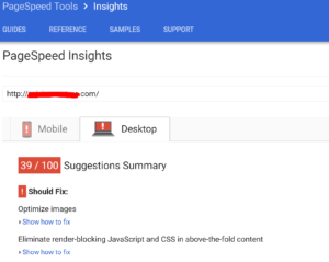
The bottom line is slow is slow. However, there are lots of factors that can influence how quickly a website loads: a user’s internet connection, operating system, desktop vs. mobile vs. WiFi, downtown versus hicktown, hosting environment, etc. When testing the speed of your site, use some good ol’ common sense and test it in a variety of set-ups (see above). Different people. Different devices. Different cities. Different times of days. Log the performance and feedback. Also, use a free speed test tool like the one Google has made available. It provides a relative speed grade for both mobile and desktop usage along with recommendations on how to improve the speed. Good tool. There are other speed test tools out there, but start with this one.

So how do you know when you site is just too darn slow? The answer is inherently debatable. But know the facts. Research has shown that 40% of site visitors will bounce if a webpage doesn’t load in 3 seconds or less. 3 seconds is pretty darn fast. We recommend to clients their sites need to load in 5 seconds or less – and that they always stay on top of their site speed. Fast is good. Slow is death.
Also, keep in mind that not every page of your site loads at the same pace. If your site is relatively fast but you have a page or two that test slow, fix those first. You can monitor site speed manually or use the most widely adopted web analytics suite in the world that also happens to be free – Google Analytics. Use it.
90% of the time the cause of a slowdown is tied to a lack of image compression/image optimization for web. Basically your pretty images are too big and not formatted correctly. Here are some great tips to address this cause & effect.
Question #3: Do you know what people are looking for when they visit your site, and do you make it easy for visitors to find and engage with what they are looking for?
Scenarios to chew on:
A. If you are a restaurant, is your address and phone # on the homepage? Is your menu one click away on every page of your site? Access to make a reservation front and center?
B. If you are an ecommerce site, within 5 seconds of landing on your site do your customers know what you sell – especially if you sell multiple categories of products? Do you clearly have a customer service link and phone number (people still pick up their phones) on the homepage? Does your site look uncluttered and exude a level of trustworthiness that begs visitors to punch in their credit card numbers? Psst!…here is a great, short article with tips to improve your ecomm presence.
If your site is a digital brochure, make it a good one. If your site is transactional, make sure the conversion process is simple and secure. Tip: Most sites – even brochures – need to celebrate HTTPS and move on from the dated and un-secure HTTP server set-up. Google loves HTTPS. And who out there wants the Ruskies to get their filthy paws on any personal info? Protect yourself and others.

The bottom line: Your site needs to convey professionalism and recency (post-2012). It doesn’t have to be extravagant, but it does have to be functional and deliver on the wants and needs of those who visit. If it doesn’t, time to reload.
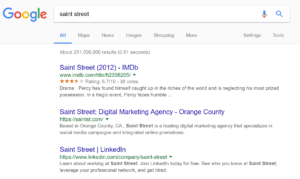
Question #4: A. When you search for your website on Google using the name of your business, does your website display in a top position in the search results? B. Also, does your listing include a clean/accurate page title, site link and meta description (huh?)?

If your site appears at the top of the SERP result, great. If it appears at the top with a clean listing (title, site link & meta description), awesome. And, if you run a follow-up query using a term (keyword) associated with your business like “orange county trial attorney” or “organic scented candles,” and you still display in a top position, BOOM! You and your site are doing something right.
If you run the above test (at least the first two scenarios), and your site fails, you need help! And fast. Sadly, we see this scenario play out all the time where small & mid-size businesses search for their own company – using their exact business name – and their site doesn’t show up on Page 1 of search results. Scary.
Here is a great Search Engine Optimization 101 resource for you to comb through produced by Moz. Many factors can negatively impact your SERP rankings, some include poor site speed, whether your site is mobile-friendly, security set-up (HTTPS), site construction and hosting, and lack of optimized meta data. Turn to an expert to audit and address. You may not need to build a new site. A keyword research and copywriting exercise may be a sufficient kick-start. Just don’t let this fester. Most businesses rely on organic search traffic to drive lead gen and business development efforts. Every lost visit to your site is a prospective missed customer.
Final Question #5: Are you proud of your website?
If you waffled when answering this question, who knows, there might be hope with what you have. Definitely invest in getting open and honest feedback from people who have reviewed your site. There is still a strong likelihood your bias maybe be overriding the objective side of your brain.
If you yelped with conviction, “My site is beyond a joke!” or something to that effect, step up and put your dying site to sleep. You owe it to yourself. It’s 2017. Building a new website is going to cost most small businesses less than $10,000. The costs vary wildly based on the site functionality you desire, the level and depth of graphic design support you’ll need, and whether you retain an experienced freelancer, a full-service digital agency, or you personally build a site using a platform like Wix, Web.com, or Shopify. Each option caries an inherent cost (time and $) and level of risk, but if you’re at a point where you need a new website to elevate your online business presence, pull the trigger. Do it for yourself. Do it for your customers. Do it because it needs to get done.
Re-launch a site that solves problems, acts as a resource, and makes you look great. And then in five years or so, when you start to get really comfortable with what you have, turn the proverbial shower back on and rinse & repeat this exercise. Our digital world is moving faster than ever before. Do your best to keep up.
Chris Lohman
Founder & Lead Strategist
Saint Street
Chris@SaintSt.com;
206-941-6935(M)
SaintStreet.com